Saturday, August 4, 2012

Bleach Technique for Papercrafting


Hot August afternoon, so I thought I would try the Double Time bleach technique from the Make It Monday #76 video tutorial from Papertrey Ink's blog Capture the Moment. The bleached stamps are there somewhere since I added a lot of techniques to the cards.  Must have been the fumes from the bleach!

I used some inexpensive stamps I had of  pansy (from Autumn Leaves) and a branch with buds and leaves from a Hampton Arts set (with a dandelion and a bird also).  Both were in the dollar bins at local craft stores.  I found some pink paper, not sure the brand or color but the bleach took well on this color compared to other colors I tried.  I double stamped the same images in PTI dye inks Berry Sorbet and New Leaf. I also use some inexpensive cubes of pigment ink in maroon and purple for variety and to make the flowers seem to come forward (lighter colors) or recede (darker colors) in the pattern.

The card needed more pizazz as the bleach effect didn't show well.  I think a stamp with a wider line would have shown more white versus the background color.  Next time!  So I got out the markers and watercolors and a paint brush and started to make the flowers pop with color.  The white marks and the double stampig and off stamping gave the pattern additional texture and dimension.

I just added a lilac organza ribbon (5/8 inch) and a small purple (Bazzill Grape Delight) tag with a sentiment as embellishment since I wanted the patterned paper and the various techniques to take center stage. 


This second card is actually my first attempt.  The white bleach stamping shows a little more since the pattern is not all over the card front. The flowers are markers blended with water and a paint brush.  The strokes were too evident so I reached for the watercolors for the second (first!) card. I darkened the flower centers and added a Recollections Faux Pearl in lilac. Maybe I should go back to the card above and darken those centers also?  A double bow of Offray 1/8 inch purple satin ribbon and a little butterfly from the scrap bin perked up the sentiment and the lower left corner.  Maybe the branches should not all be at the same angle next time?  I added those in the upper left at the end because that corner had too much negative space.

Design can be tough, but it was a cool way to spend a hot day in my basement studio. 


Thursday, August 2, 2012

August Card Workshop


Summer Fun card for tomorrow's workshop is a card with several pre-made embellishments. That's just what you need for summer--some easy shortcuts!  I used K & Company Color Basics Radiant Multi cards and envelopes in yellow, green, blue and pink. I borrowed Bonnie's wave die cut again.  I used our group's Top Note die cut from Stampin' Up to make the blue polka dot pop-up frame. The papers were from a designer paper pad called Everyday Flair from Six by Six by My Mind's Eye,  I loved the dots and checks because they remind of summer fun from my childhood. The beachball and flip flops were from Gartner Studios' Summer Fun Confetti pack of 30 shapes (no adhesive). The sentiment is stamped in Versamark black ink using one of three stamps in the Stamp Craft set from Plaid.  And lastly, the adhesive pennant border was from Momenta. This is not an A2 card so the only hard part was designing in a little bigger space.  That's where the pennant border came into the design!


The second card is masculine. We have a lot of requests for masculine get well cards in our community through our outreach committee.  I saw a tutorial on Pinterest by Dawn Olchefske for "Triple Time Stamping."  She used florals but I had some compass, gears and globe stamps from Stampers Best that I thought might work with Dawn's technique. It was successful I think!

I cut the 3 ivory stamp areas and 3 chocolate mats using these sizes:  2 X 3.25 and 2.25 X 3.5 for the center layer, 3 X 4.25 and 3.25 X 4.5 for the middle level and 4 X 5.25 and 4.25 X 5.5 for the outside layer. Laying the three ivory pieces together, stamp all over with background (I used Gears and Papertrey Ink Fine Linen ink pad) and then a larger, darker pattern (I used the Compass and PTI Dark Chocolate ink pad). I used ivory cover stock from Staples for the stamp areas and the card itself.  I also used Staples A2 envelopes in ivory.  I had some chocolate paper in my stash. I think it was from Wal-Mart since it had the perforations and extra paper at the top with a hole in the center of the stack.  I also found a scrap of teal paper for the tags to coordinate with the stitching in the Burnt chocolate stitched Offray ribbon.  I cut the tags out of a Stampin' Up die cut by Sizzix called Lots of Tags.  I had some jute leftover from last month's workshop design.  I stamped the compass again and cut it out with a 1.5 inch circle punch.  A bigger punch, maybe 1.75 inch, would be a better fit, but it worked to cut it smaller.  I popped it up with foam tabs and colored the needle red with a marker. I even got out the brown marker to make the stitching on the tag to reflect the stitching in the ribbon. I'm very happy with the results.

Thanks to Dawn for the idea and my stash and my friends for the supplies!  That's the way a summer project should go together.  Just a little effort --and no trip to the store in the sweltering heat and humidity!

Tuesday, July 24, 2012

Summer Sun Birthday Card


I saw some sandpaper at the hardware store and thought of using it for a beach!  I borrowed the waves and beach chair and sun die cut from a neighbor and scrounged through my stash and --
VOILA!

The beach chair and sun are die cuts from Sizzlits. The wave border is from Taylored Dies.  I used a sentiment from Papertrey Ink's Framed Out #6:   Celebrate today.  I had an old die from QuicKutz which I had originally used for a bridal shower invitation.  When I was done, it was missing something in the upper right corner. I found a stamp from Hampton Art Ditto of a swallow--and hope that stamped in white ink it looks like a gull!  It had a tiny heart that I colored red to match the chair and umbrella stripe and pole and make that dark red "pop."  Happy Birthday, Amy!

Sunday, July 22, 2012

Moose Sighting!

I finally finished the curtain project for my son's family's pop-up camper. The fabric was dark green with large moose.


It was a great fabric with a plaid border edged with wood. The moose were large and lifelike!  The coordinating print was a houndstooth check with teal, green and aqua.  The panels were attached by velcro to sliding plastic connectors with sticky velcro squares.  That's a pillow in the center.  I had just enough fabric left over to make it, too.


Here they are in place!

Tuesday, July 10, 2012

Papertrey Ink Make It Monday Challenge 7.9.12

Stamping on Texture--

Two Variations on an Anniversary Theme


I needed two anniversary cards for two nephews and their wives who live in Indiana and Colorado.  I watched Heather Nichols stamp on texture on Papertrey Ink's Make It Monday and decided, for the first time, to join the challenge.  I used Papertrey Ink's Background Basics: Text Style to stamp on two different textures using similar themes on slightly different colored backgrounds.


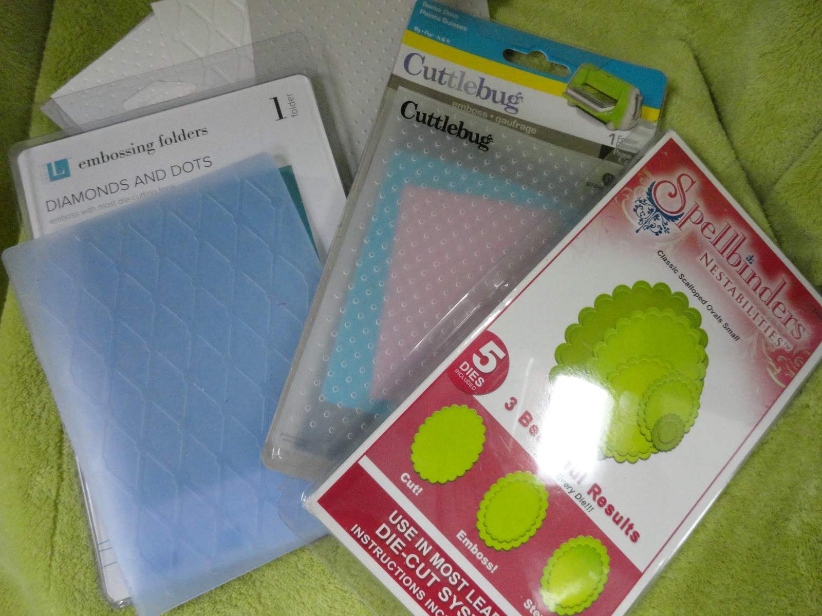
On grey and white cardstock, I embossed texture using Cuttlebug's Swiss Dots and Lifestyle Crafts' (formerly QuicKutz) Diamonds and Dots embossing templates.  Using Penny Black's day-dreams stamp, I die cut and embossed the image in an oval with Spellbinders' Nestabilities' scalloped oval set. I then colored the stamped image with a variety of Marvy Le Plume markers, a blender pen from Stampin' Up, and ink pads from Plaid: periwinkle and citrus green. 


I used the Plaid ink pads to stamp the text style on the textures, using periwinkle on grey Diamonds and Dots and citrus green on white Swiss Dots textures. The white stamped texture did not contrast enough with the white oval so I distressed the textured and stamped background around the edges and near the oval with Papertrey Ink's Fine Linen Dye Ink Pad to make the oval contrast more with the stamped texture.


I added some faux pearls from Recollections, a sheer lavender ribbon and bow from my stock, and a sentiment from Stampin' Up's Sincere Salutations set: Happiness Always.


I hope the couples will get the same message--in different textures and colors!


Saturday, July 7, 2012

Family Event Cards


I made this card twice, one for each new grand-niece to welcome them to the family.  I included a sterling silver spoon of my mother's inscribed with "CJ". Callie or Caroline Johnson was my mother's grandmother and the babies' great-great-great grandmother. I had each spoon engraved with the girls' initials.  Welcome, little girl cousins Samantha and Margaret, to the family.


My grandson, Craig, was 12 on July 5th.  He received this card in the mail.  I used the Rosie Posie hexagons from Papertrey Ink and some pre-made embellishments to make it fun for him to open.


This helped make it a twelve-year old boy's birthday card, too!


Friday, July 6, 2012

Greeting Cards for July


Bonnie brought this card design to our workshop and we all made a card from her kits. She said it was difficult to fit the squares on an A2 card.  I think she did it--and the colors are lively.


Bonnie's other design was a lovely color combination with lacey doilies and butterflies.  Even the background was embossed with butterflies.  Can't wait to send it to a niece for her birthday in July.


Carol's design used a floral border stamp that we colored with markers, some honeycomb yellow patteerned paper and a great ribbon.  I used Bonnie's bee stamp for some action.


I brought a design with two variations on a similar theme. I used the Rosie Posie stamps from Papertrey Ink and stamped directly on the patterned paper as shown in the most current Make It Monday from the same company.  I added a bee stamp and the turned up corner for some dimension.


My other design used more masculine colors to go with the brown grosgrain ribbon.  The flourishes were stamped directly on the patterned paper.  The sentiment was stamped with a flourish on the embossed oval die-cut.

We all have different styles, but together we make a great group and a wonderful bunch of cards.